handle and care is a series of publications related to storing art and the art of storing
initiated by Lisa Sudhibhasilp and Vincent Knopper
for any inquiries: info@handleandcare.nl
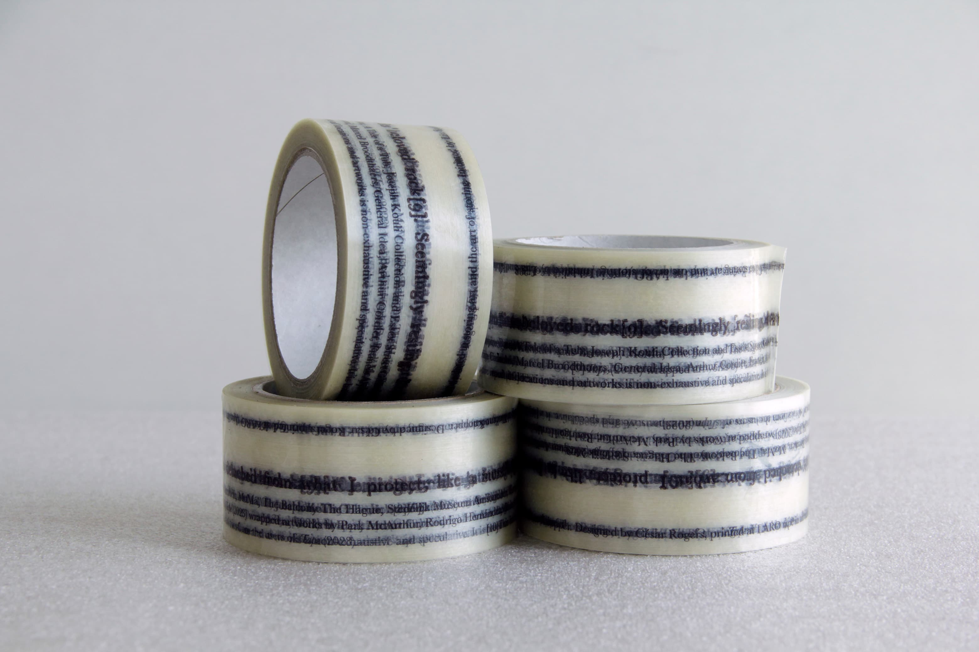
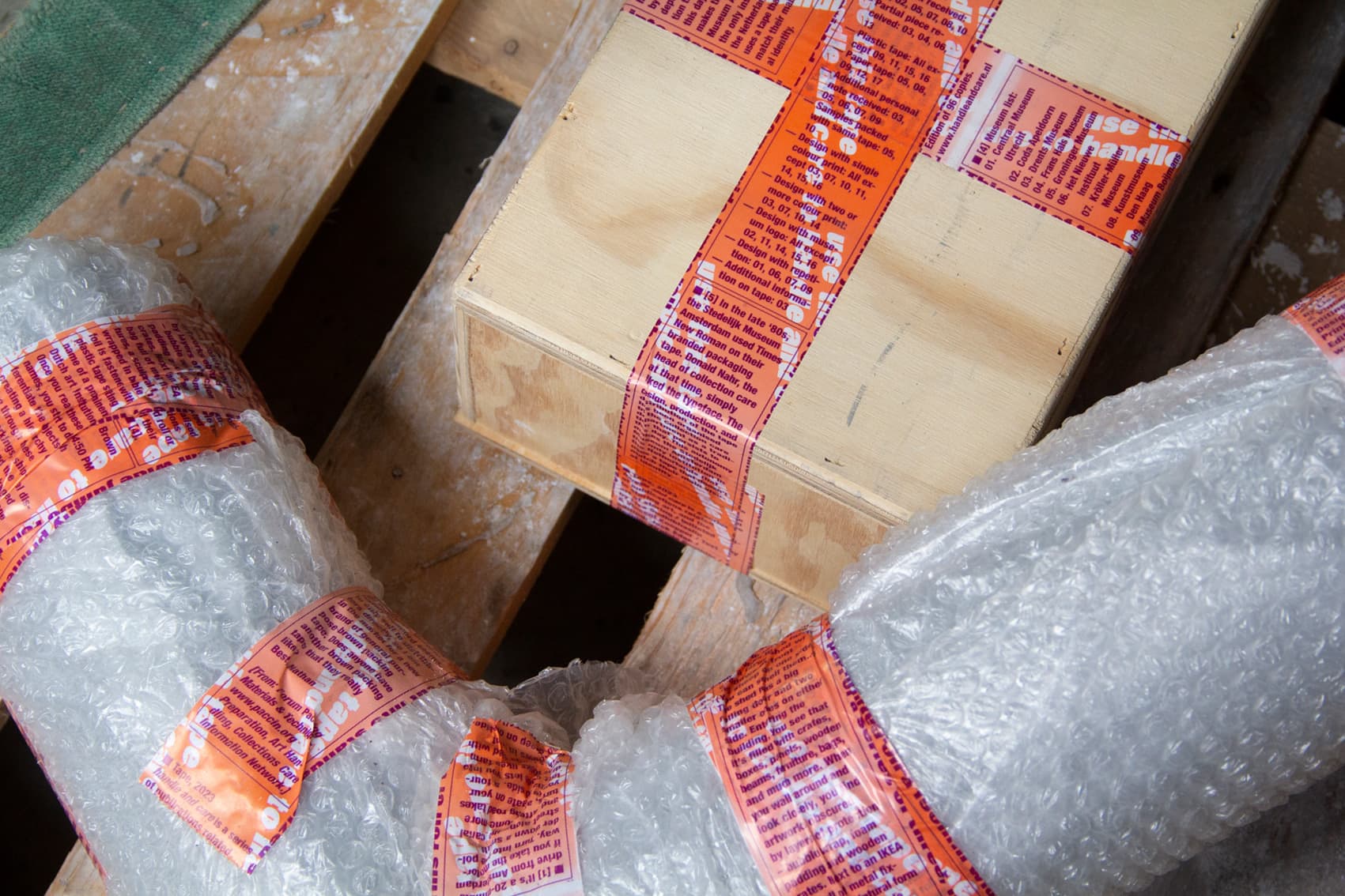
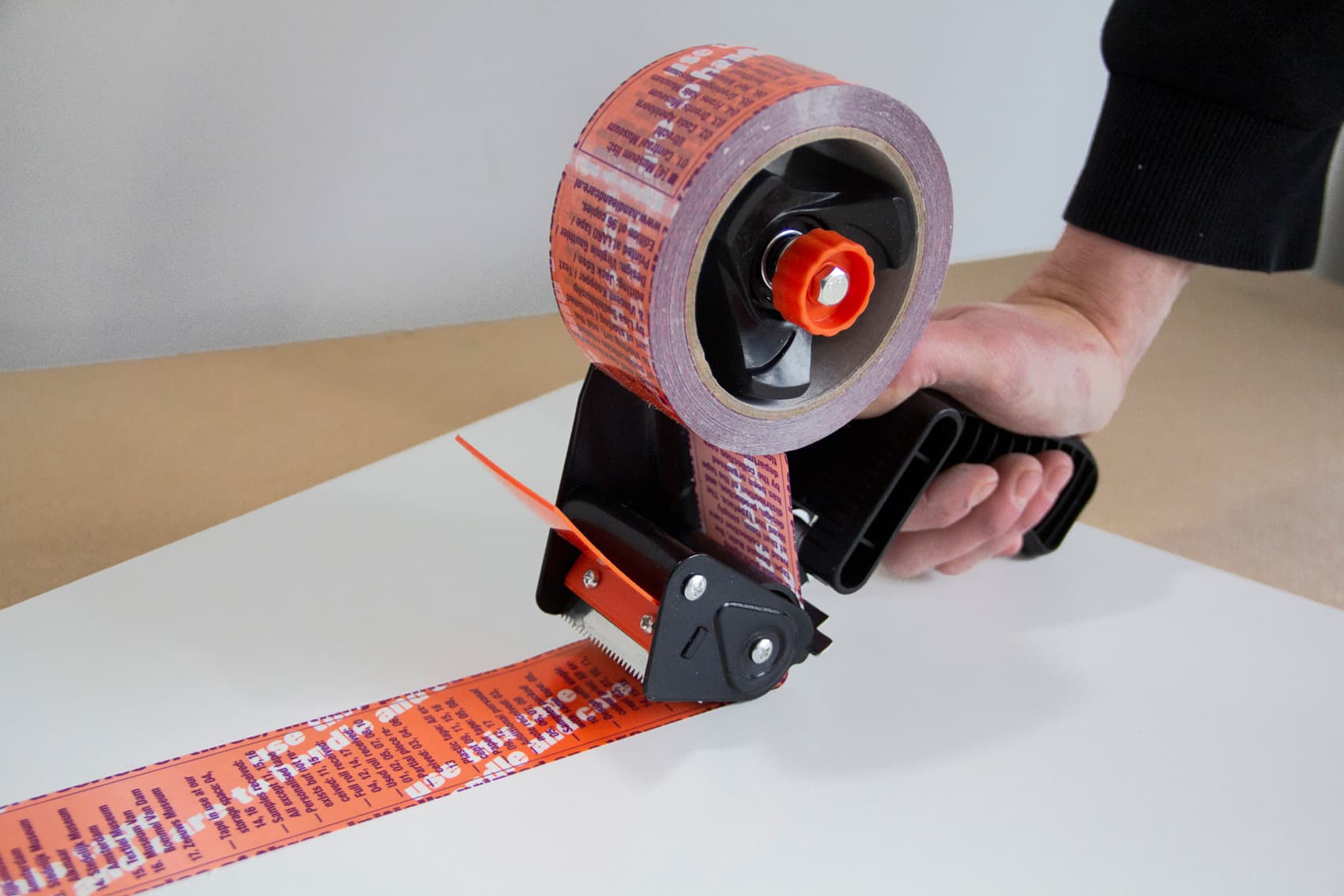
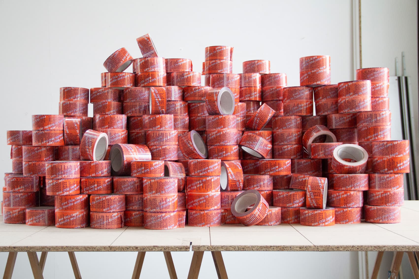
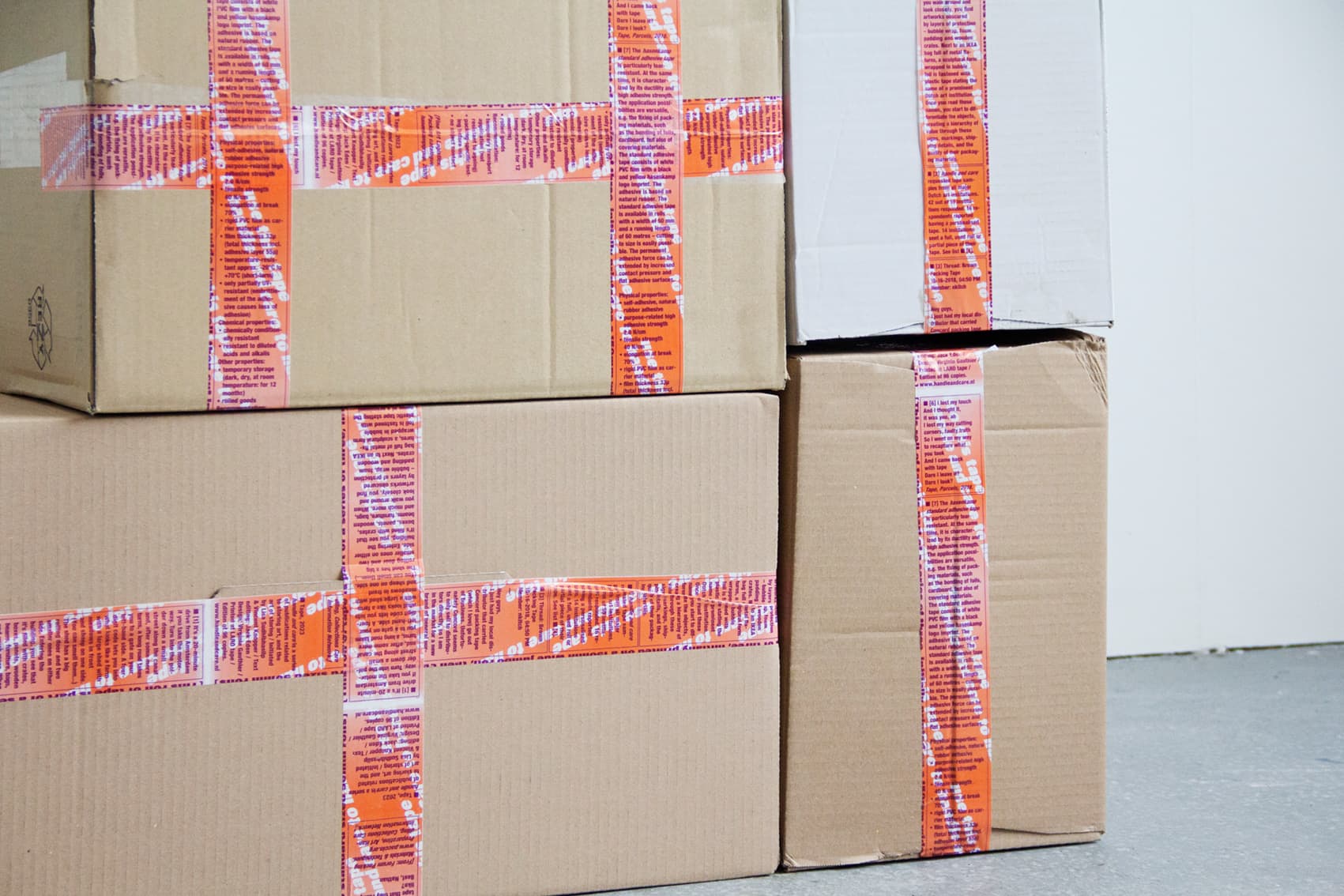
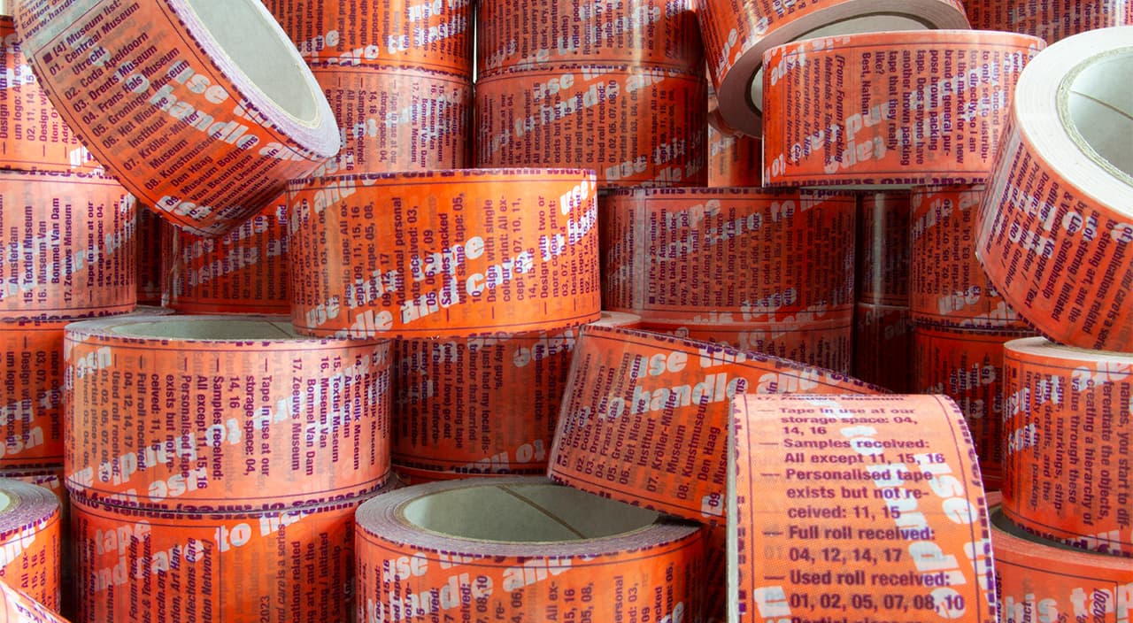
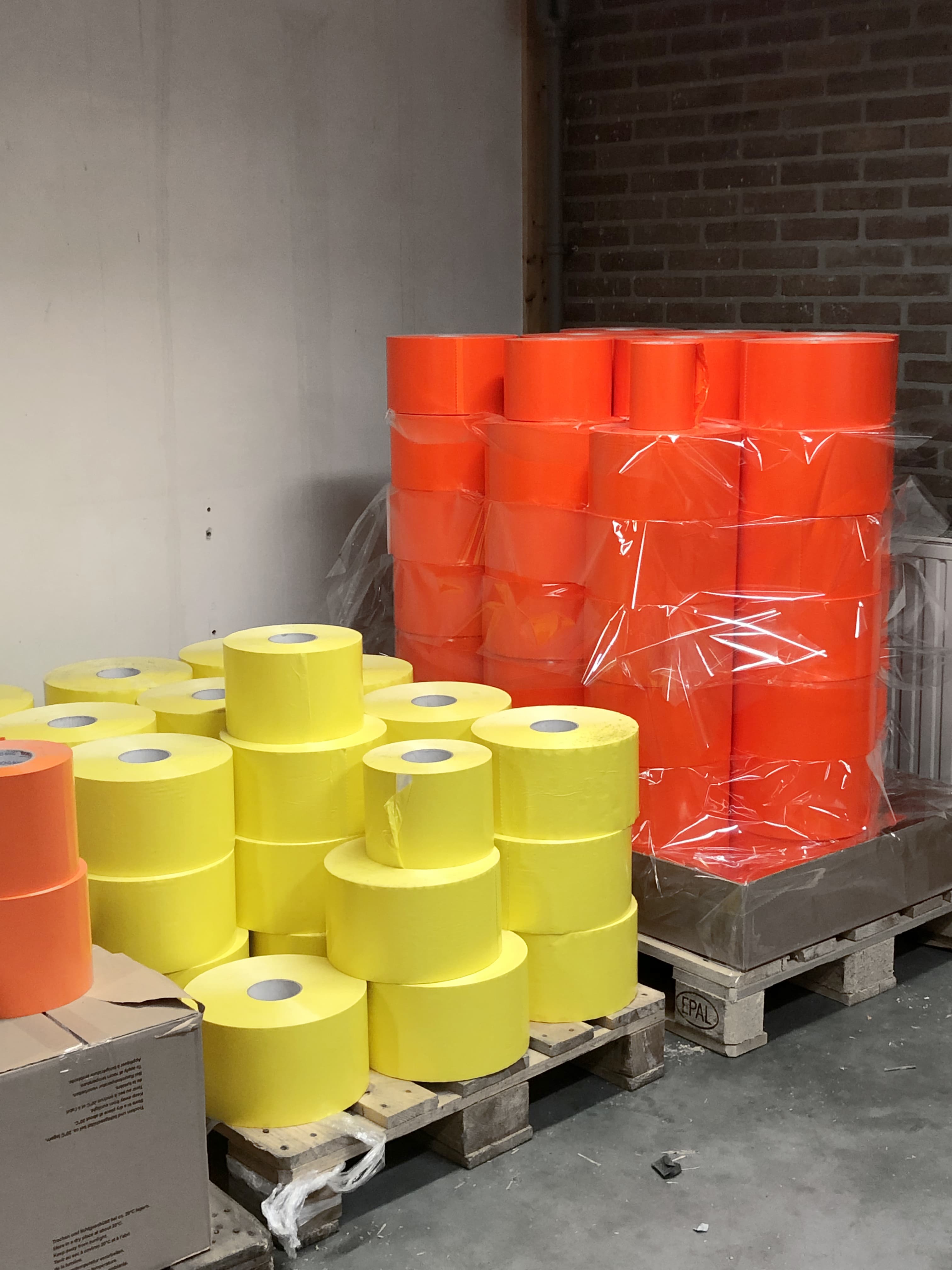
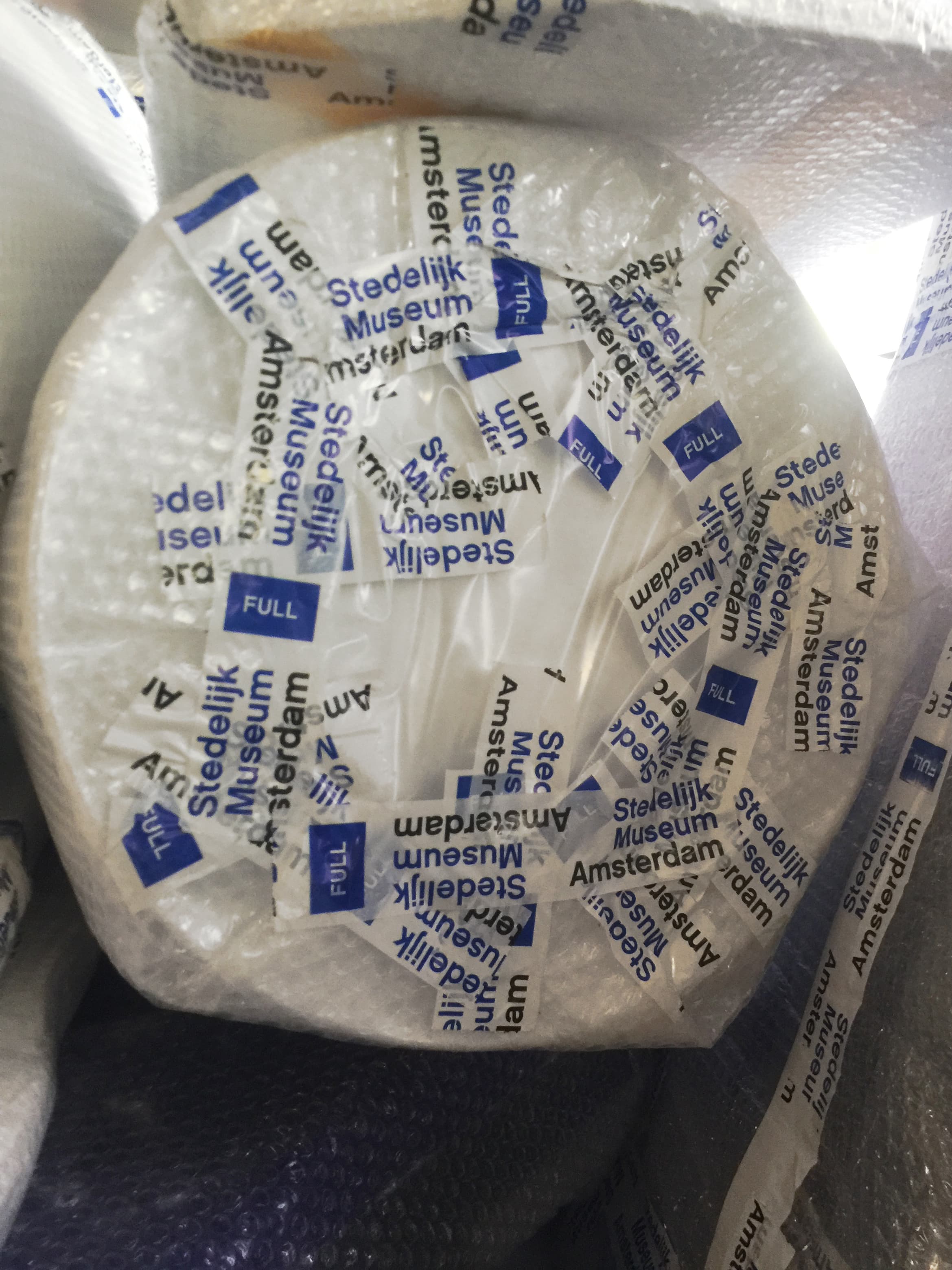
Tape II (dormant), 2024, designed by César Rogers, is the third publication by handle and care. This publication, in the form of a packaging tape, poetically describes the activity of tapes in the context of art storage. It also reflects on the circulation of earlier publications, the institutions they travelled to, and the artworks they touched.
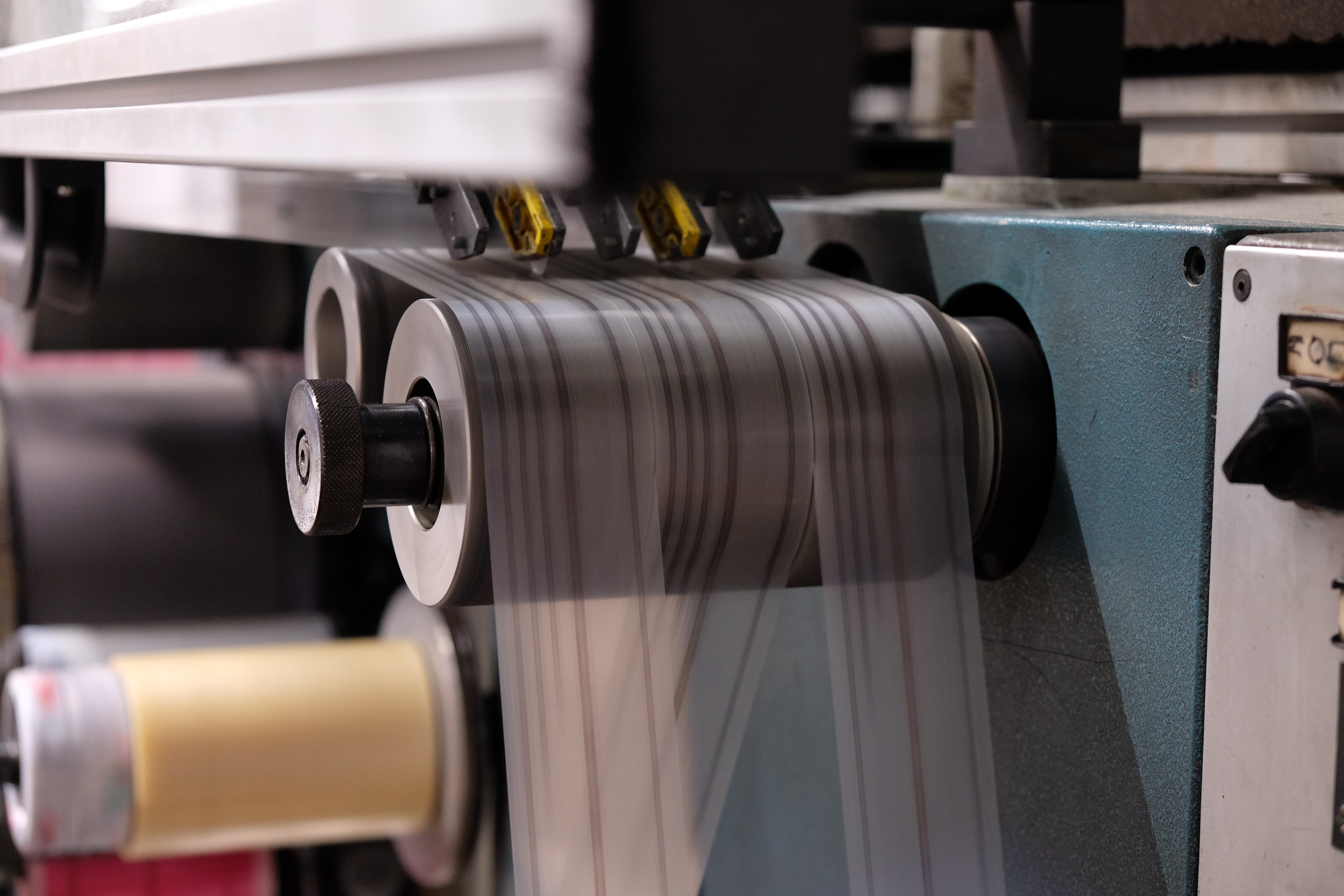
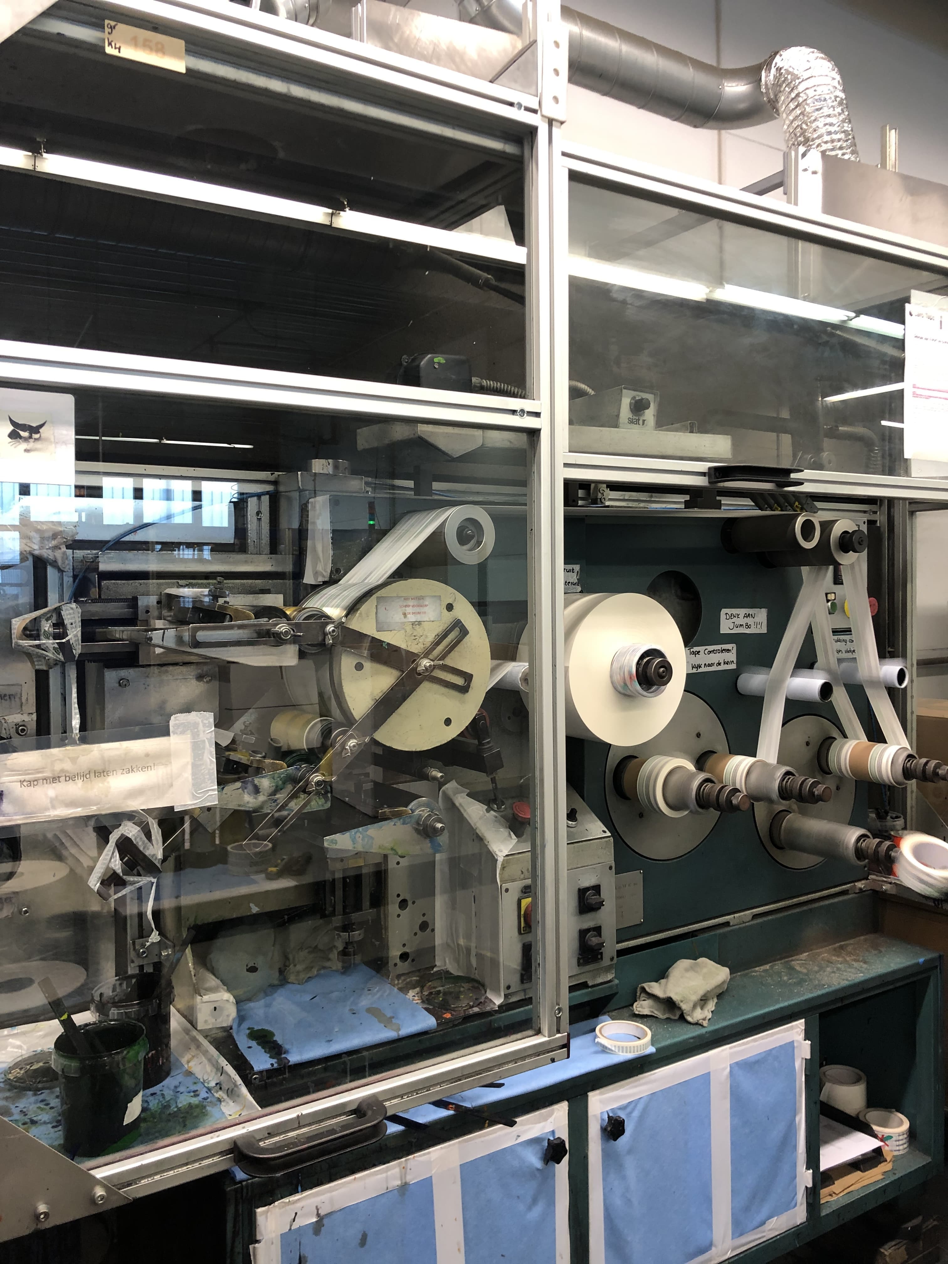
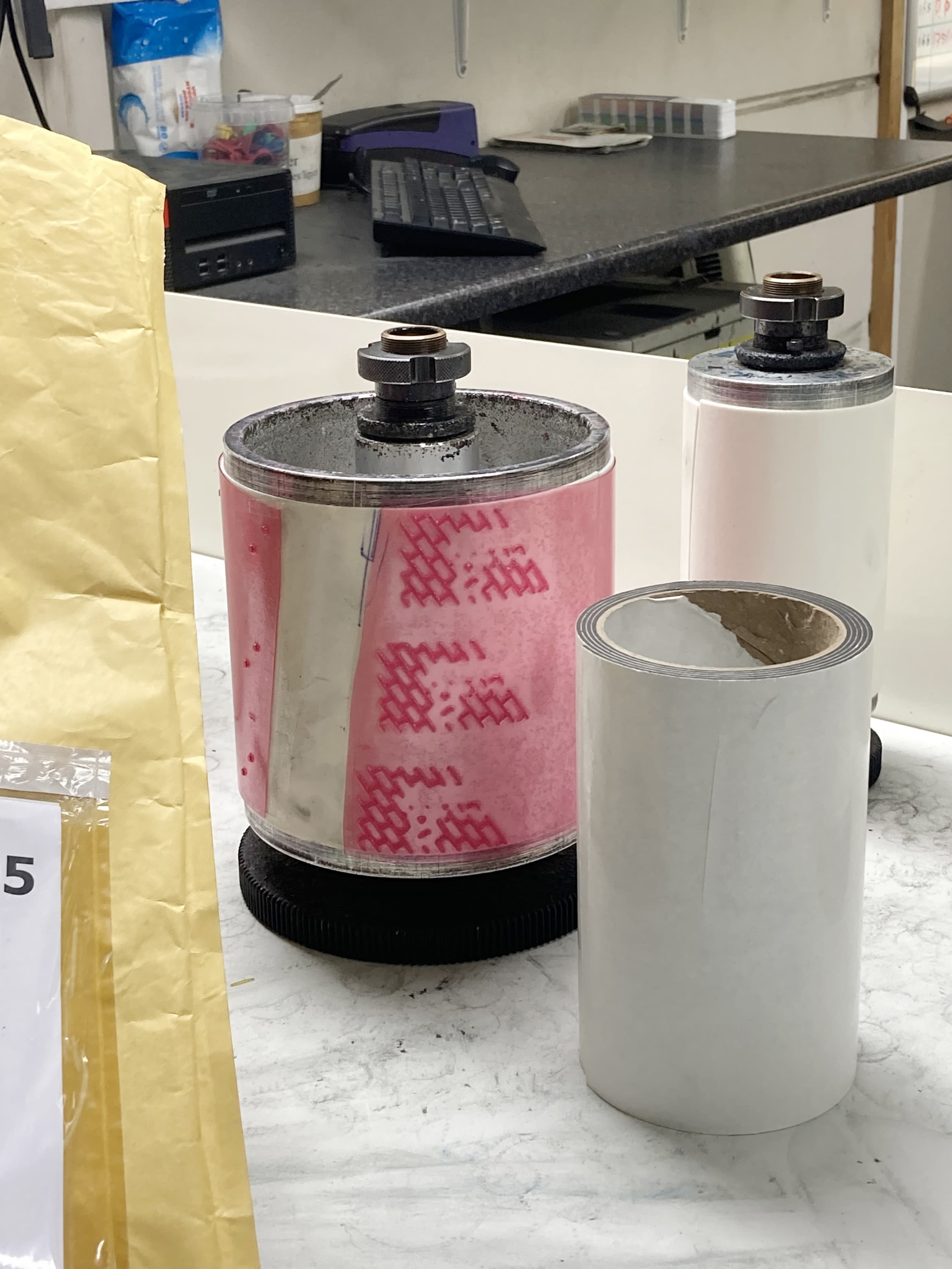
The main text was printed in letterpress using the Baskerville typeface, 12 points, as it is the minimum size of text that LaroTape could print. The original print was scanned and outlined in order to be printed in two colours, two shades of brown, in an attempt to mimic the letterpress stamp-like bleeds of ink.
The brown colour was chosen by designer César Roger to resemble old books. When stored in shelves, the paper ages and goes from white to light brown. It gets humid and the grease from letterpress ink soaks onto the next page, going from black to browner and browner as time passes.
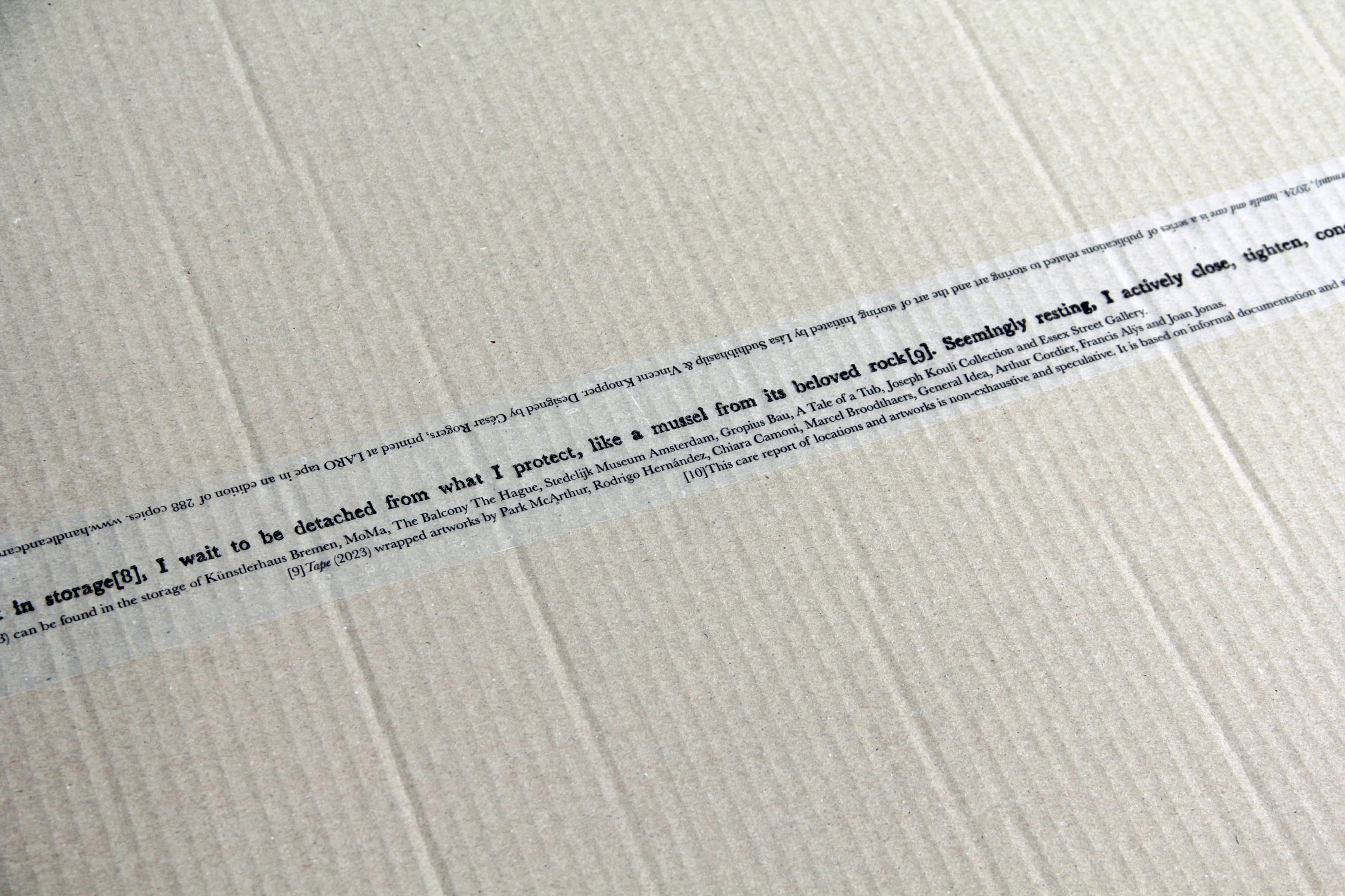
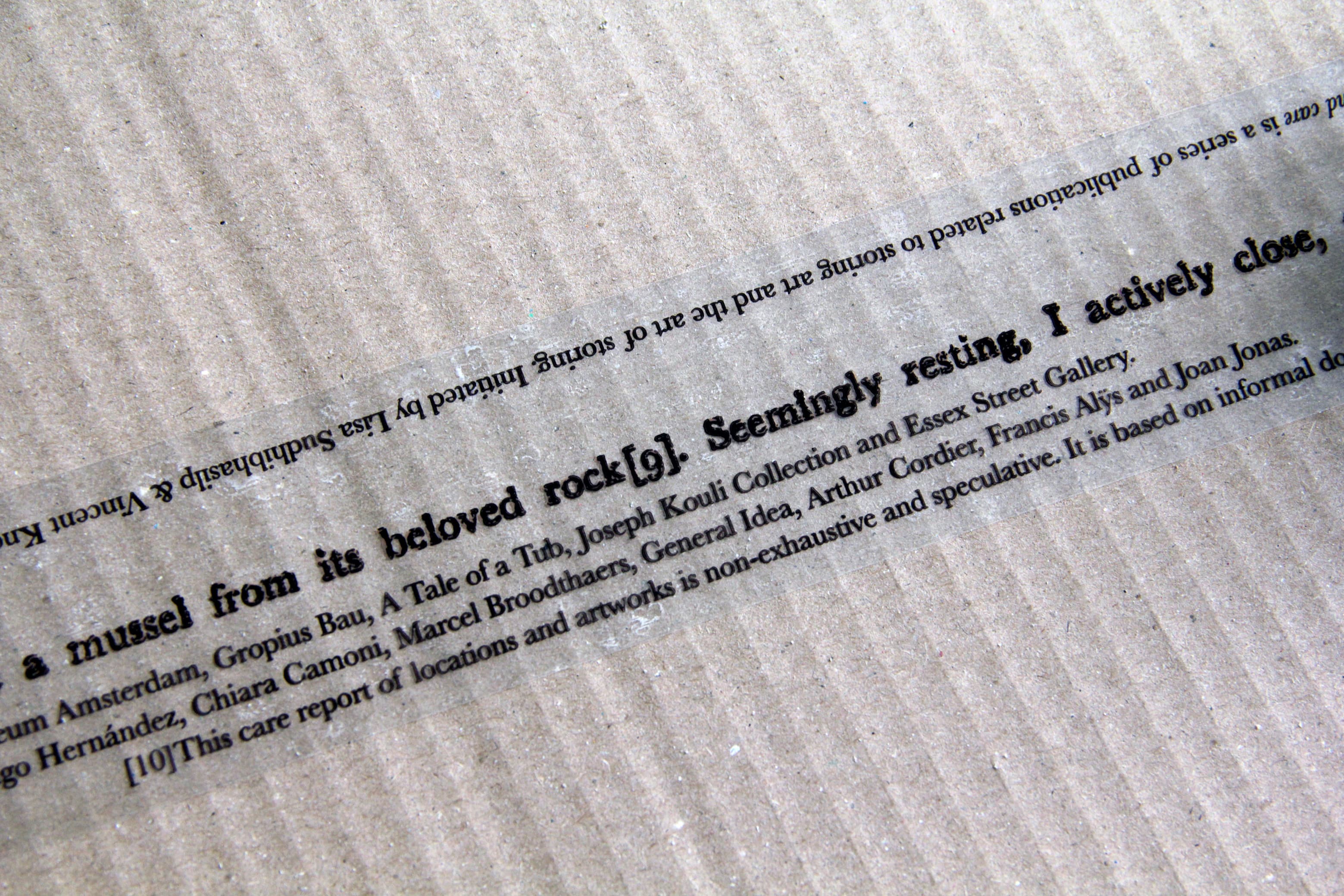
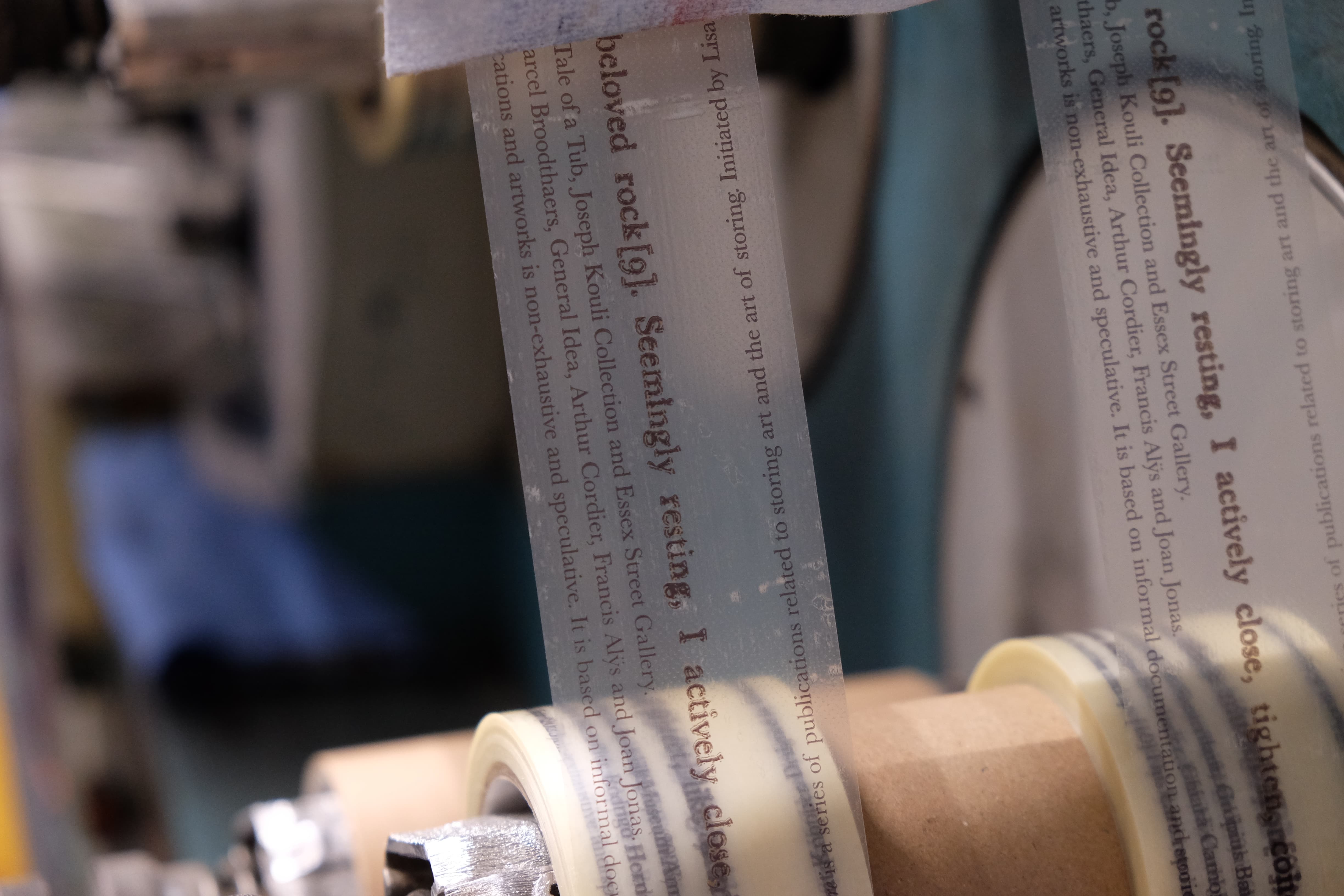
Dormant in storage (8), I wait to be detached from what I protect, like a mussel from its beloved rock (9). Seemingly resting, I actively close, tighten, conceal and care (10).
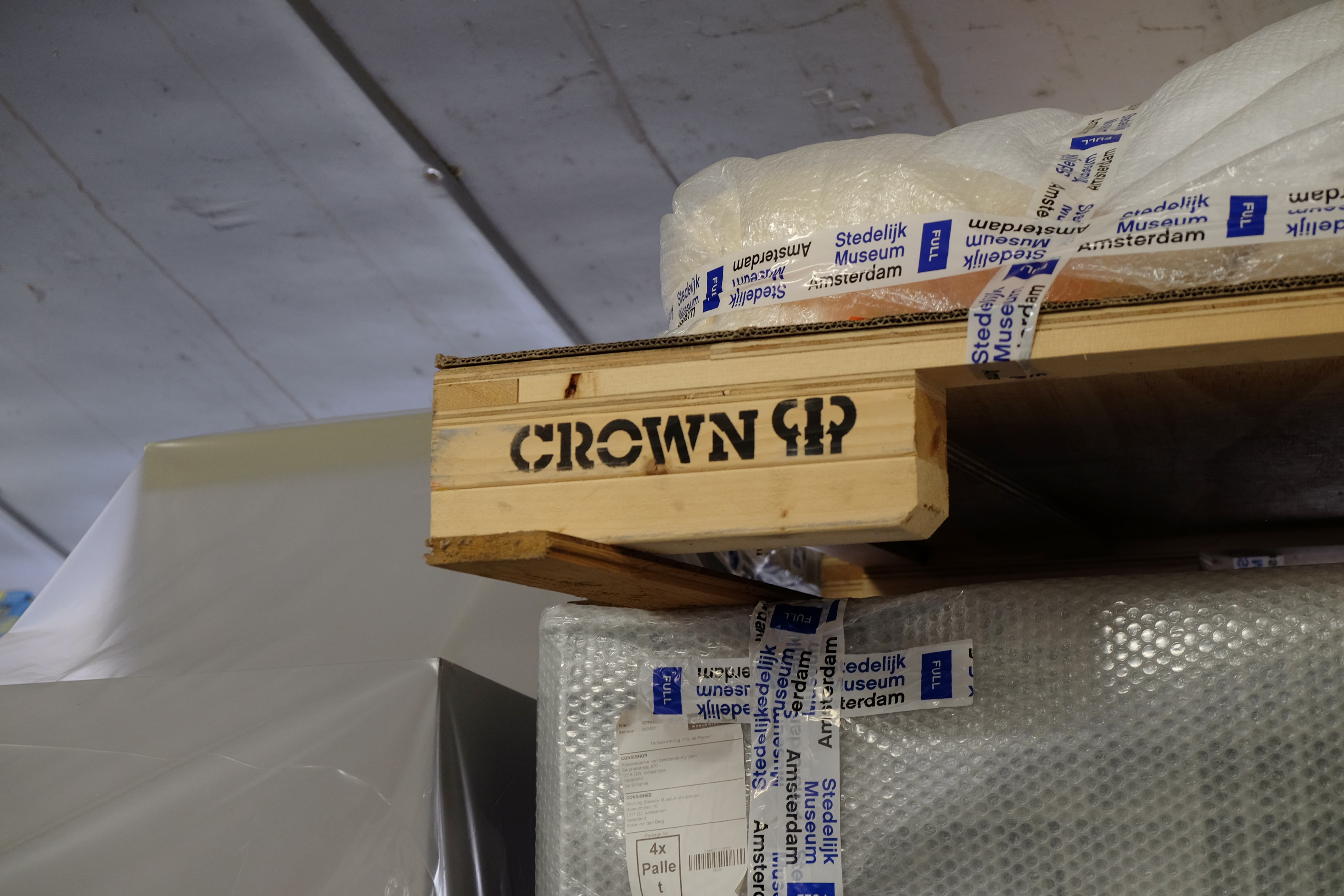
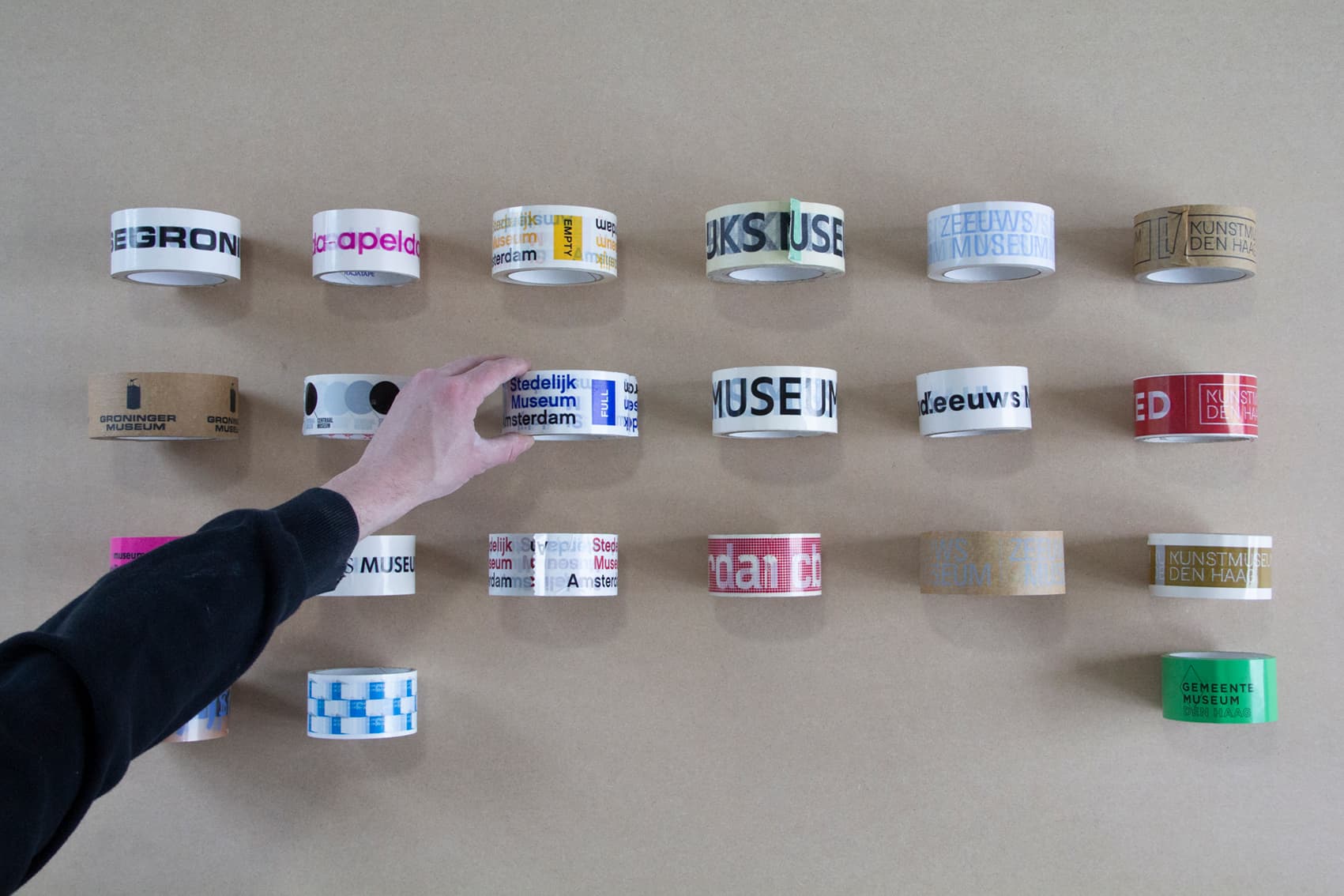
(8) Tape (2023) can be found in the storage of Kunstlerhaus Bremen, MoMa, The Balcony The Hague, Stedelijk Museum Amsterdam, Gropius Bau, A Tale of a Tub, Joseph Kouli Collection, and Essex Street Gallery.
(9) Tape (2023) wrapped artworks by Park McArthur, Rodrigo Hernandez, Chiara Camoni, Marcel Broodthaers, General Idea, Arthur Cordier, Francis Alÿs, and Joan Jonas.
(10) This care report of locations and artworks is non-exhaustive and speculative. It is based on informal documentation and stories from the users of Tape (2023).